top of page

In this part, I will create a few graphs in order to have a better understanding about this dataset.
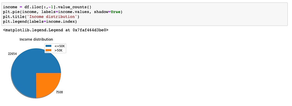
First, I will create pie chart on the 'income' column, which is our target to see the distribution of our target.
data understanding: Text
data understanding: Image
Based on this pie graph, we can see that our target only contains 2 classes which is '<=50K' and '>50K' and it looks like the '<=50K' class has much more values than the '>50K' class.
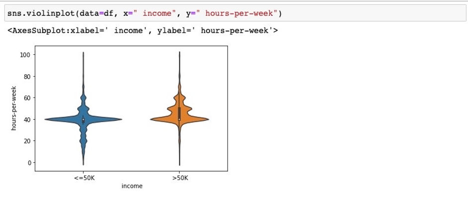
Let see how 'hours-per-week' factor affects the income.
data understanding: Text
data understanding: Image
It is very interesting that the shapes these two plots are kind of the same, which means there are people who work roughly 40 hours a week and make the income less than 50K. However, there are also people who also work 40 hourd per week and make more than 50K annually. We can say that income is affected by other features such as workclass, education, occupation, ... For example, a doctor with PhD degree will definitely makes the income of more than 50K if they work 40 hours a week, and a farmers with high school degree would probably makes less than 50K a year if they also work 40 hours a week.
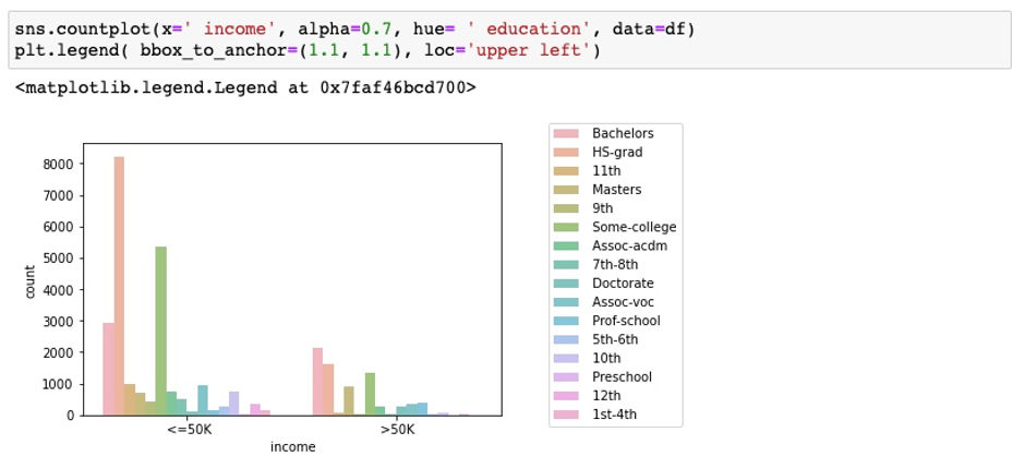
Now, let see how different levels of education affect the income.
data understanding: Text
data understanding: Image
Looks like people who only graduated from highschool and did not go to college tend to make less than 50K a year. Meanwhile, people with higher degree such as Bachelors, Masters and PhD tends to make more money than people who only have highschool degree.
Next, let see how much different occupations make!
data understanding: Text

data understanding: Image
It looks like 'Exec-managerial' and 'Prof-specialty' are likely to make more than 50K a year. Meanwhile, 'Adm-clerical' and 'Craft-repair' are likely to make less an income of less than 50K a year.
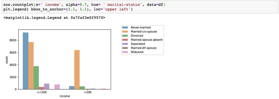
Let see how different marital status (divorced, widowed, never-married,...) affect the income.
data understanding: Text
data understanding: Image
bottom of page