top of page

I used this function to see the names of columns in this dataset. Through the names of columns, I am able to have the insight or the initial understandings about this dataset.
data understanding: Text

data understanding: Image
I will use this function to observe the types of data in this dataset. After observing the types of data, I noticed that this dataset contains both numerical data and categorical data, which I need to take care of before building my regression model on this dataset.
data understanding: Text

data understanding: Image
Now, I will check the correlation between the features in this dataset by creating correlation heat map.
data understanding: Text

data understanding: Image
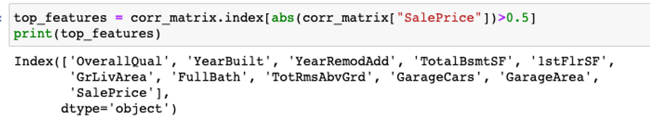
Based on this heat map, I can tell that there are some featured that are correlated with our target SalePrice. I will print out the features that are the most correlated to SalePrice.
data understanding: Text
data understanding: Image
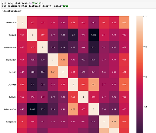
Now, I will create another correlation heat map for all these most correlated features to our target SalePrice
data understanding: Text
data understanding: Image
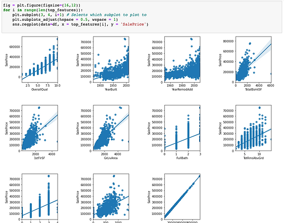
I will also plot the graphs showing the relationship between the most correlated features and the target (SalePrice)
data understanding: Text
data understanding: Image
Let's check if our target (SalePrice) is skewed or not.
data understanding: Text

data understanding: Image
We can conclude that our target is actually positively skewed since the tail on the right side of the distribution is longer. In this case, we need to transform the value in SalePrice to make fix the skewness.
data understanding: Text
bottom of page